
Mansam Fine Fragrances
An Enchanting Tribute to Arabian Heritage
An Enchanting Tribute to Arabian Heritage
Mansam isn't just a perfumery; it's an enchanting tribute to Arabian heritage, skillfully blending the ancient alchemy of Al Kindi with modern science to create fragrances that transcend time and culture. Each scent crafted by Mansam embodies an emotion or feeling, invoking passions and memories while inspiring forward-thinking perspectives.
At the heart of Mansam's brand identity lies its emblem, created using Arabic calligraphic techniques, drawing inspiration from the noble date palm tree, celebrated for its symbolism of rest and hospitality in Islamic culture. Rooted in the Arabian desert, the emblem encapsulates the essence of sea, sand, and earth carried by the desert winds. The brand's color palette takes inspiration from the Arabian Peninsula, with golden shades, desert hues, sunset glows, and pearl-like luminescence, creating a sensory journey through the rich landscapes of the Arabian world.
Matelec
Matelec’s Evolved Identity
Powering the Future: Matelec’s Evolved Identity
Matelec, a leader in electrical equipment manufacturing and power infrastructure contracting since 1974, has evolved into a multinational presence across Europe, Africa, and the Middle East. As the company expands its reach and diversifies its offerings, a strong and unified brand identity becomes essential to reinforcing trust and recognition in an increasingly competitive market.
-scope Ateliers led the rebranding by preserving the core equity of Matelec’s identity while introducing a refined and contemporary look. The signature M emblem, inspired by the sharp geometric forms of transformer materials, was reimagined within a circular frame to balance strength with approachability. A new wordmark with rounded type and mixed-case lettering further enhances the brand’s accessibility. Complemented by a dynamic secondary color palette and cohesive design system, the refreshed identity modernizes Matelec’s image while staying true to its industrial roots.

Flour Power
Reviving Lebanese Culinary Traditions with a Modern Twist
Reviving Lebanese Culinary Traditions with a Modern Twist
Launched in 2021 as a small food business during a summer food market, Sasha Bassil's flatbread venture has evolved into Flour Power Lebanese Flatbreads. This "Manaish Saj" concept offers vegetarian and vegan flatbreads that celebrate this culinary tradition of Lebanon. The name "Flour Power" plays on the word "flour" for dough and "flower," that symbolizes the art passed down through generations of Lebanese women, from whom Sasha learned the craft in the mountains.
The identity, developed by -scope Ateliers, is both illustrative and playful, with a nod to the 70s hippie movement, reflecting the owner's personal resonance with that era.

Salwa London
Salwa’s baking haven, from Saida to London
Salwa’s baking haven, from Saida to London
Salwa, a self-made entrepreneur, hails from Saida, Lebanon, but has found her baking haven in London. Her passion for baking ignited early on, and she refined her skills through workshops with renowned chefs. Salwa's commitment to her craft shines through her delectable creations.
Salwa's bakery embodies perseverance, hard work, and a profound love for baking. Its contemporary, modernist visual identity, meticulously crafted by -scope Ateliers, draws inspiration from Levantine geometric shapes, resembling small mignardises. This design pays homage to her Lebanese heritage and mirrors the precision she infuses into every aspect of her business.

Nayla | eat . sip . shop
Nayla | eat . sip . shop
Fusion of Jewelry, Fashion, and Café Culture
Nayla, an interior architect, intertwines her passion for crafting jewelry and fashion items with the allure of Japan's captivating charm. Her café, nestled in the heart of Beirut, doubles as a concept store, showcasing her own creations and a curated selection of items from other designers.
Inspired by Nayla’s hand-signature, -scope Ateliers crafted a typographical logo that preserves the fluidity of her original signature. This logo serves as a visual testament to Nayla's touch in every nibble or accessory that she offers. A set of line-drawn illustrations and a series of taglines add a playful layer to Nayla's brand.
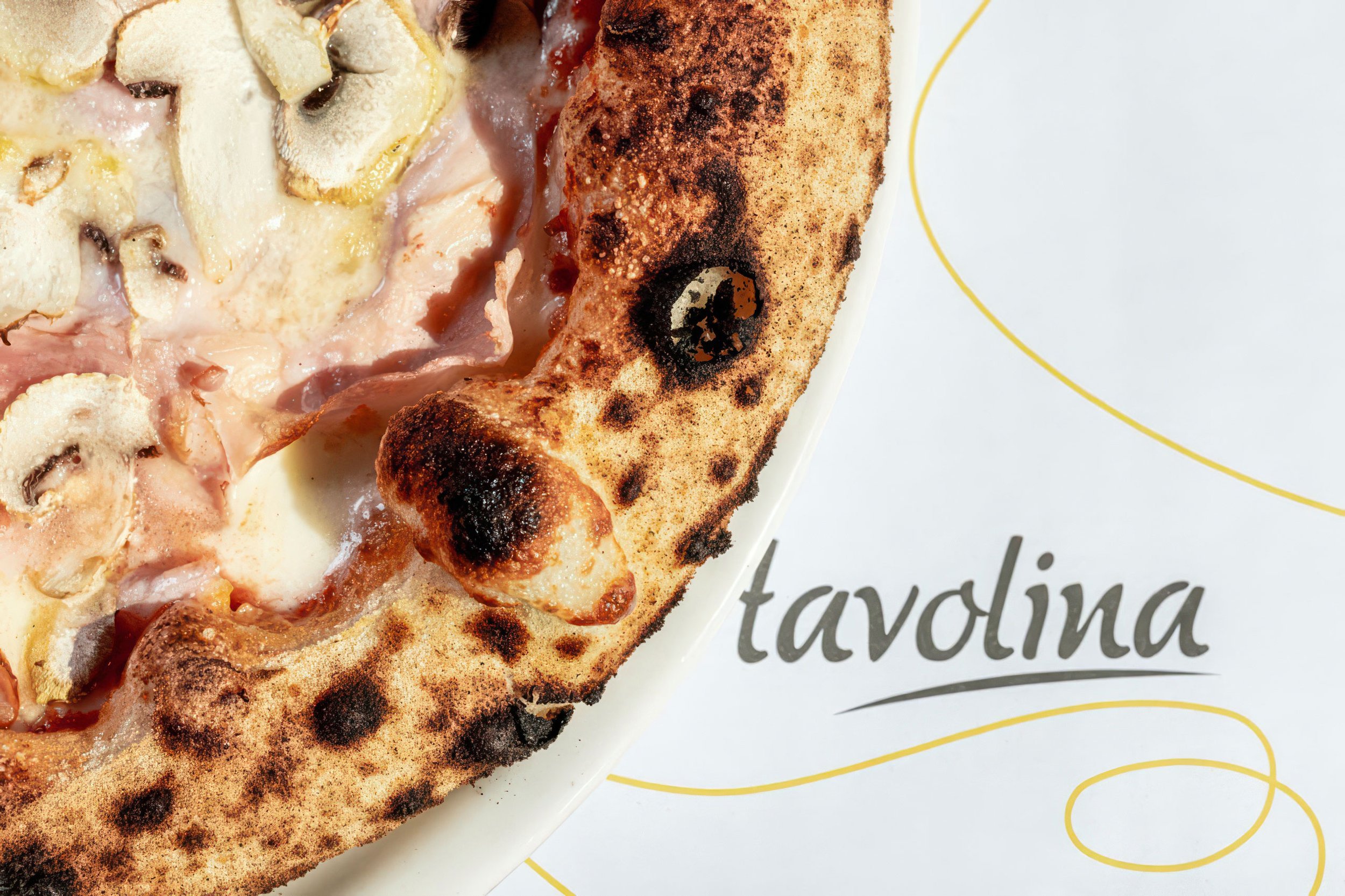
Tavolina
Tavolina | Italian eatery
Tavolina’s Visual Recipe: A Unified Brand Identity
Tavolina, a beloved Italian restaurant born in Mar Mikhael, has grown beyond its original location, opening new outlets across Lebanon. To unify its visual identity, -scope Ateliers stepped in to redefine and streamline the brand’s aesthetic, as the existing visual treatments varied too widely and lacked cohesion.
The design team at -scope Ateliers created a fresh, cohesive identity using a playful spaghetti line motif. This versatile line twists and transforms into ingredients, words, pizzas, pasta shapes, glasses, and other elements, making each brand application unmistakably Tavolina. This new approach not only ties the restaurant’s outlets together visually but also captures the essence of its Italian roots in a creative and engaging way.
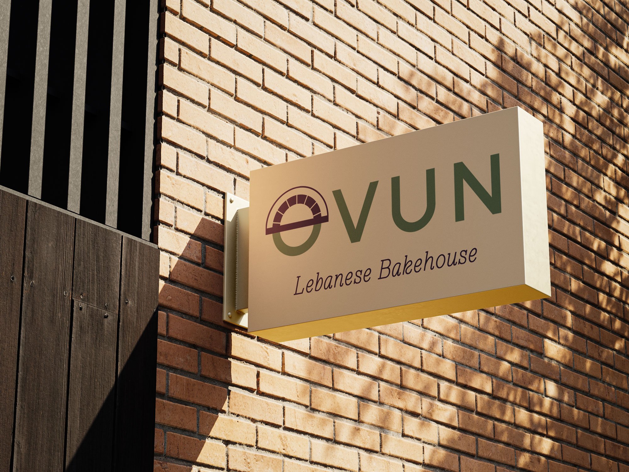
Ovun | Lebanese Bakehouse
Ovun | Lebanese Bakehouse
Crafting Authentic Lebanese Delights with Global Flair
Drawing upon a legacy of Levantine seasoning mastery and rooted in the rich bakery experience of al Mouajjanati's founder, Ovun emerges as a fresh Lebanese bakehouse, offering an array of high-quality baked delicacies.
The brand curates an exquisite range of high-quality delicacies, drawing inspiration from baked goods spanning the globe, all while infusing an authentic Lebanese essence to every bite. With an expansive assortment of savory delicacies and sweet treats freshly baked every day, complemented by a diverse selection of coffee, salads and sides, Ovun is a neighborhood go-to spot, perfect for breakfast, lunch, tea-time and beyond.
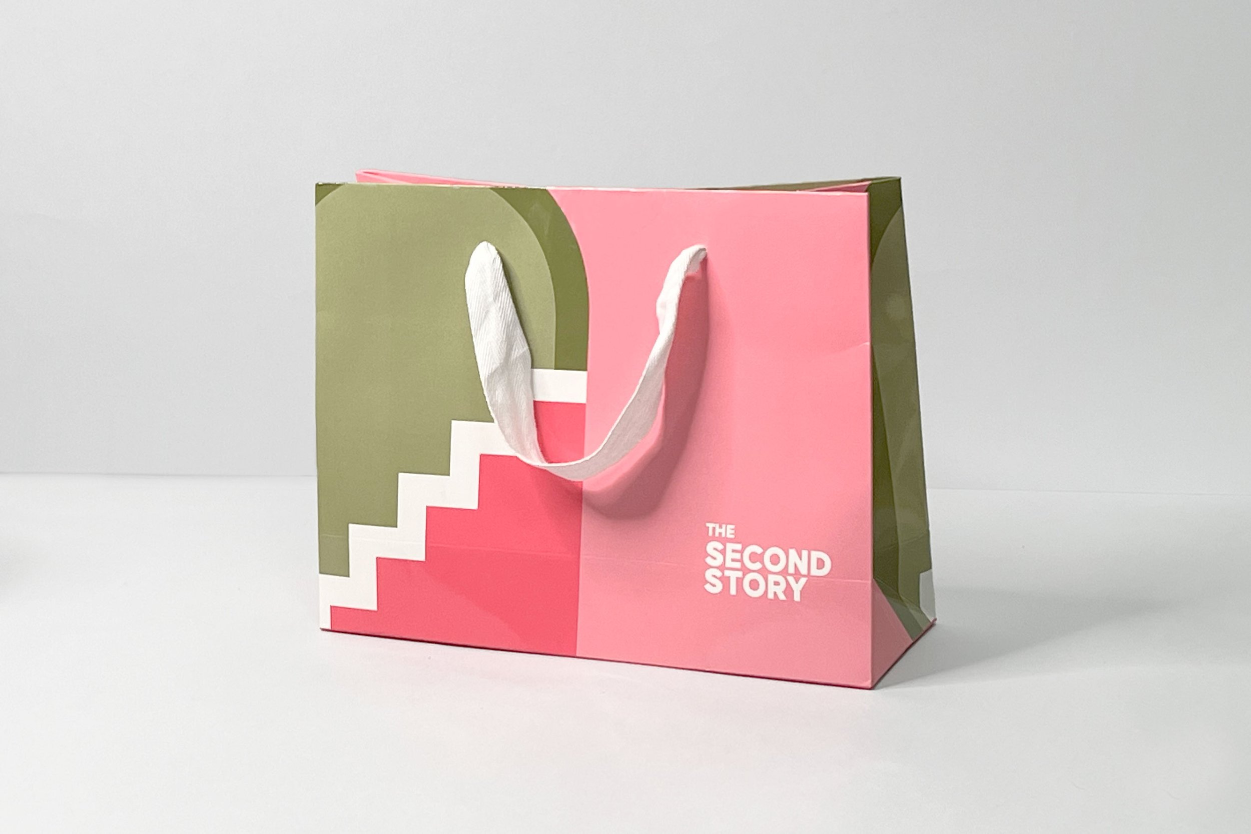
The Second Story | rebranding
Retelling the Gentleman's Story.
Retelling the Gentleman's story
A gentleman’s story is one that get rewritten and retold. So is the second story, a boutique (for the modern gentleman) that has evolved, and which’s identity reflects on that evolution.
After creating TSS’s identity in 2016, -scope Ateliers created a whole new identity that echoes the change of mission of the store.

I&C Bank
A New Trusted Bank on the Financial Scene
A New Trusted Bank on the Financial Scene
FFA Private Bank has become i&c, Investment & Capital Bank (بنك الاستثمار والتمويل), to support the current need in the banking sector to resume financing the Lebanese economy, ensuring new trusted banking services for individuals and corporate.
The new bank’s brand was designed to use FFA’s equity and distinctive strengths. A new emblem was created based on FFA’s 3-line emblem, oriented upwards. The triple-slash stands for consistent growth, and the square within which it is inscribed for stability, despite all odds.
S2 Silkscreen
A Passion for Printing.
A Passion for Printing
Salim Samara, an experienced and self-taught master silkscreen printer, needed a new name and brand identity for his printing workshop.
A problem solver and a master in unique technique approaches, the entrepreneur’s initials (a double S, just like the words Silk and Screen), and his love for his art, inspired -scope Ateliers to create an identity that reflects this passion.

Sufra
Flavors from the Beqaa Valley.
Flavors from the Beqaa Valley
Sufra is a new farm-to-table concept, developed in times of deep crisis in Lebanon, and inspired by the Beqaa farmer’s meals. The first flagship outlet, located in Besten el Hor leisure resort near Zahlé, serves Lebanese specialty dishes and includes a marketing platform with retail (mouneh) items produced in the holding’s workshop in the Beqaa. The aim for the brand is to be scaled in urban environments as a rural escape within the city.
The diversity of the agricultural products of the Valley, Lebanon’s prime agricultural region, inspired -scope Ateliers to use a wide color scheme of earthy colors that reminds of the Beqaa landscape, and to create line drawn icons of the main produce used as ingredients in Sufra’s dishes.
The result is a rich visual identity and house style, used on a full range of menus, packages, in-store visuals and communication material.

Attié Frères
Refreshing the 100-year old brand.
Refreshing the 100-year old brand
A bee on a white background framed by honey-colored cells. This design is what has made Attié Frères’ star product, their nougats packaging, recognizable for almost 90 years, and has become somewhat the trademark of the brand. In our mission to rejuvenate the brand, we had to keep these elements, as they make happy memories for so many Lebanese, like the inexpressible joy Proust experiences tasting a Madeleine perfectly illustrates!
The packaging has been rejuvenated, nevertheless retaining the colours, the spirit and the calligraphic style of the chocolate factory on cardboard boxes which can contain a kilo, 500 grams and – a sign of the times – an ounce of daisies or Chocolate Rocks.
———————-

Lyliad
Leather experience, handcrafted in Lebanon.
Leather experience, handcrafted in Lebanon
Lyliad leather goods are conceived by Lebanese designers and artisans working in a unique exploratory lab in Beirut. Lyliad’s sober and timeless models are designed to honor the nobility of the materials, and to showcase the skills of the artisans who meticulously handcraft every item and accessory as unique.
The name of the brand derives from the Arabic word “لليد”, a tribute “to the Hand” of the persons who create these goods. Lyliad also refers to Homer’s long poem; a hint to the odyssey we would like our products to embark on with you.

1969 Outlet
A Modern Outlet for the Urban Man.
A Modern Outlet for the Urban Man
1969, a new men’s outlet concept in the heart of Achrafieh, offers a wide variety of men’s fashion apparel and accessories. Opened in 2019, 50 years after events of great importance in the popular culture, 1969 pays tribute to an iconic year that still fascinates, brought to life through the branding, decor and memorabilia around the store.
That was the year the human race first set foot on a celestial body outside the Earth, an event watched worldwide by millions. That summer, the famous Woodstock music festival took place in upstate New York, crystallizing the culture and identity of a whole generation. The Beatles, the Western world's most popular band, released their final album to be recorded: Abbey Road.
An outlet in Beirut, 1969 offers discounted prices ending with 19 or 69 (items start at $69, then $119, $169, etc.).
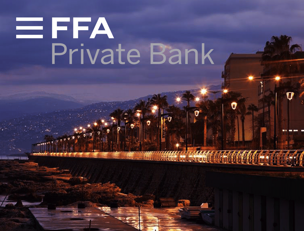
FFA Private Bank
The Brand reengineering of the Group.
The Brand reengineering of the Group
After celebrating their 25th anniversary, FFA Private Bank Group undertook a brand reegineering and a change of logo. The original visual identity of FFA includes an emblem made of 3 horizontal lines in a blue square, an element with years of equity. In the new identity, the 3 lines have been freed from their “outer walls” forming an emblem that is more modern, yet still brick-shaped.
Linear and contained versions of the logo have been created to accommodate for the different branding and usage needs. As such, FFA Private Bank and FFA Real Estate are displayed on one, two or three lines. The house style, including color palette and typefaces, was refreshed and made more contemporary and dynamic.
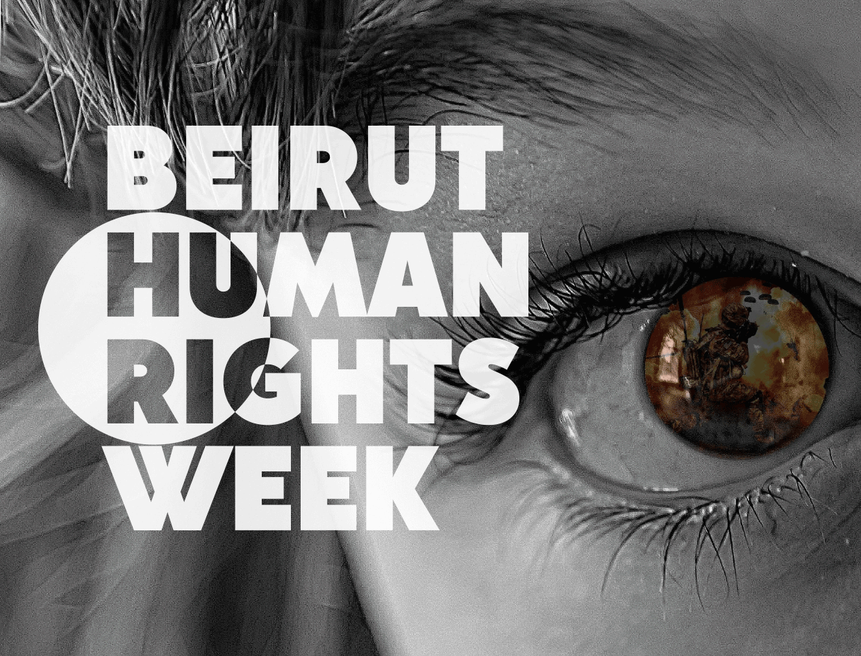
Beirut Human Rights Week
An event by the Institute of Political Science at USJ.
An event by the Institute of Political Science at USJ
Beirut Human Right Week is an event organized by the Institute of Political Science at USJ on the occasion of the 70th anniversary of the Universal Declaration of Human Rights. The event hosts various seminars and workshops on topics such as freedom of expression, violence against women and citizen participation in election, a field trip and a movie night devoted to the theme of human rights.
-scope Ateliers' approach of the logo design puts a spotlight on Human Rights, which can be moved around on different applications.
A program and a series of visuals were developed for the event.

Al Mouajjanati
The Lebanese Concept Bakery setting ground in Beirut.
The Lebanese Concept Bakery setting ground in Beirut
-scope Ateliers was approached to develop the brand concept of a Lebanese bakery that specializes in 'mouajjanet' (or small bakery bites) with generous servings, a wide range of products and a varied choice of flavors.
A brand name, a visual identity and the store’s visual language were needed. The name 'Al Mouajjanati' takes hold of the craft of Levantine bakery making.
The chosen location for the flagship store, the happening district of Hamra, inspired -scope Ateliers to create an urban brand that takes from both the tradition of Arabic calligraphy and the modern approach of calligraphity. House style illustrations and graphics were designed for application on a full range of packages, in-store visuals and communication material.

Geek Express
The higher art of Geek.
Geek Express
The Higher Art of Geek
In its Saifi locale, Geek Express transitioned from a popular and sub-culture platform for collectables to an exhibition gallery celebrating the artistry of illustration, comic, pop and street art by established and up-and-coming artists. The one-of-a-kind Beirut space needed a new logo that expressed the more established identity and purpose, as the previous bubble-comic logo became more of a novelty.
With a shift of mission also in mind, Geek Express has since become an academy offering kits and workshops for kids and teens in Coding, Engineering, and Technology.
The new standout identity was developed to be recognizable in black and white as well as in color. -scope Ateliers designed a distinct typographic logo/emblem inspired by angular overlapping formations and primary color schemes of modernist Art.
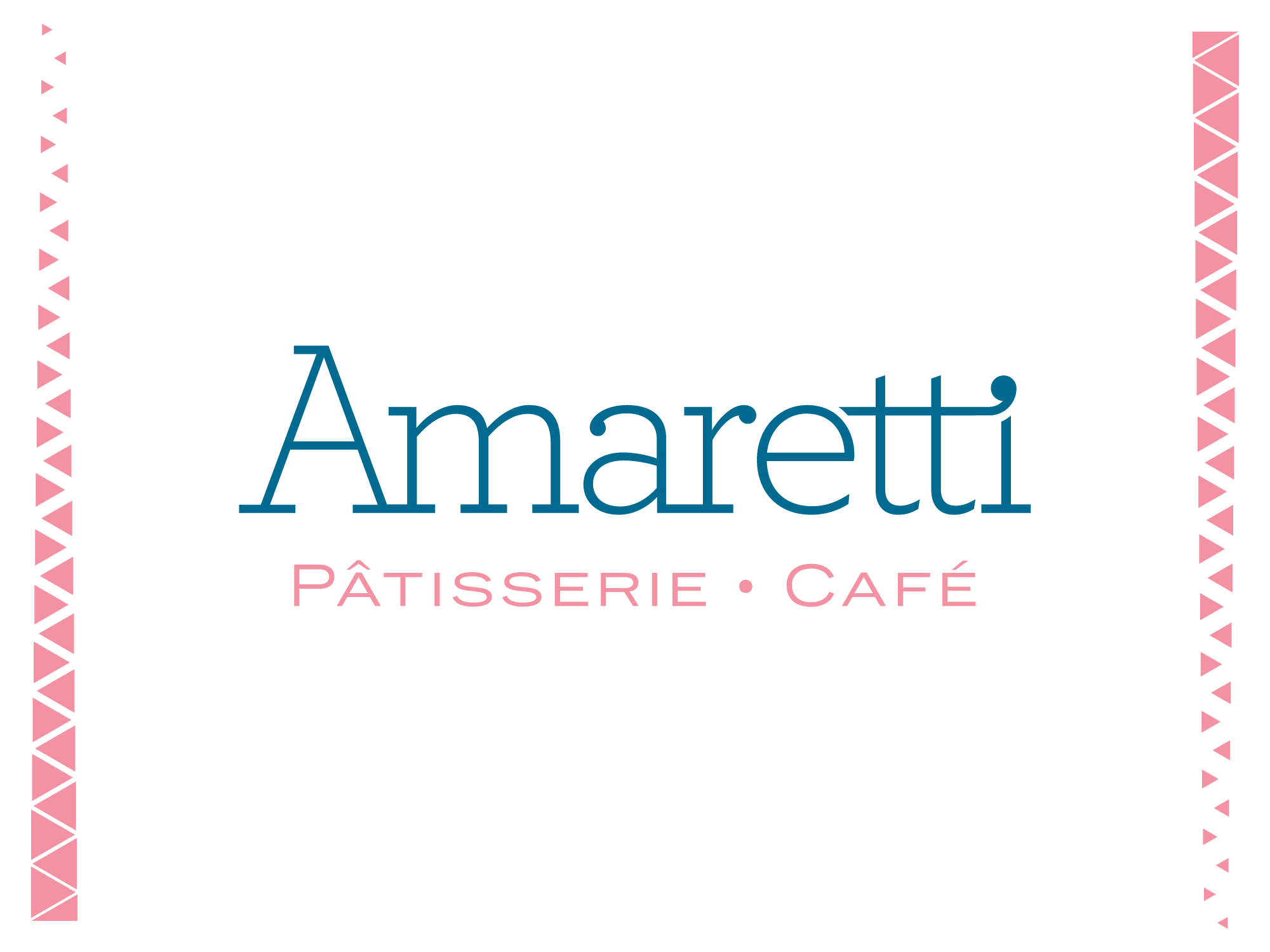
Amaretti
From a Café into a Brand Name.
From a Café into a Brand Name
Established in 1996, Amaretti started off as Amaretti Café, a coffee shop in the suburbs of Beirut that gradually expanded its culinary services and offerings to include a full service restaurant, take-home treats and catering business.
Amaretti Café approached -scope Ateliers to update their brand image.
-scope Ateliers suggested and developed a brand architecture and subsequent brand visual identity that clearly and accurately communicated what the once small coffee shop actually did. Amaretti became the overarching master-brand with three sub-brands: pâtisserie, gourmet and catering. The logo was redesigned and house style patterns designed for application on a full range of packages and communication material now unmistakably Amaretti.
